One of the more persistent challenges we’ve faced at my day job in recent years has been adapting our “plug-in” web apps to the design constraints of our resellers’ website products. Think, for example, of a camera store widget that can be added to an existing page on an existing website. The user should be able to select from a library of different designs and color schemes to try to make the integration with the site as seamless as possible. When we first built the infrastructure for handling different internal designs, we also came up with some baseline widths (500px, 750px, 950px, etc) that we thought would be able to accommodate the needs of any website designer. Then we wrote separate CSS style sheets for each design, color, and width combination. This seemed like a reasonable approach at the time, but in practice it’s become a real headache as we’re constantly having to adapt to the specific width requirements of each new vendor. And our recent forays into WordPress themes and Facebook frames have only exacerbated the issue.
A while ago, I read and reviewed the book “Handcrafted CSS” which contains a chapter by guest author Ethan Marcotte describing what he referred to at the time as “fluid grids”. The idea intrigued me — even though it was missing a few key ingredients for our specific problem — and I filed it away to think about later. Then Ethan Marcotte released his own book, “Responsive Web Design”, which has since taken the web design world by storm. I bought and read a copy late last year, and I’ve since presented the ideas at my day job where we’ve decided to use them in the next iteration of our flagship product. I’ve also done a mild redesign of the Orbi Software site using RWD in order to demonstrate its flexibility, as well as to finally provide a mobile-friendly version to my users.
What Is Responsive Web Design?
Similar to the terms “Ajax” and “Web Standards”, “Responsive Web Design” refers to the bringing together of several existing technologies in such a way that they can be used to create more flexible web designs. RWD allows you to create web pages that dynamically change to suit the proportions of the display canvas. Specifically, RWD leverages the following three ideas:
- Flexible, grid-based layouts.
- Flexible images and media.
- Media queries (a module from the CSS3 specification).
The goal is to embrace the flexibility inherent in the web without sacrificing the control necessary to create well ordered and aesthetically pleasing designs. And because this is achieved through the use of standards-based technologies — albeit with a slight shift in philosophy — it’s become a very popular technique in the web design world.
Flexible Grids
Grids have been a standard of graphic design since its inception. Designers borrowed the grid systems that were a necessity in the early days of typography and print setting, and they repurposed them to create aesthetically pleasing and ordered layouts. Up until the emergence of the Internet, though, design grids always assumed a static canvas or page size. While statically-sized grids have been widely used on web pages in order to improve modularity, their usefulness diminishes when the size of the canvas — or browser window — is dynamically changed based on user input, preferences, and screen size. And with so many new devices being introduced with different form factors, it’s hard to come up with static designs that behave well for any page rendering. RWD seeks to address this issue by making the grids flexible, i.e., using relative and proportional sizes that scale based on the amount of space available.
To build a flexible grid, first start off with a static grid, making sure that the columns and gutters are all uniform in size. For example, you could build a grid that’s 960 pixels wide, with 70 pixel columns and 10 pixel gutters. Once you have your static grid in place, relative sizes can then be calculated using this simple formula:
target / context = resultThe “target” is the desired size of the element in pixels, and the “context” is the size of its containing element in pixels. Just move the decimal point of the “result” two places over and you have a percentage that you can plug into your style sheet:
width: 17.391304347826%; /* 160px / 920px = 0.17391304347826 */Marcotte recommends leaving the calculations in your CSS as comments so that it’s easier to make changes later, and I’ve found this practice to be very helpful as I iteratively tweak things over time. It’s also important to note that when setting flexible margins on an element, the context is the width of the element’s container, but when setting flexible padding on an element, the context is the width of the element itself.
Flexible Images (And Rich Media)
Images and rich media objects can also be configured to dynamically resize themselves based on the size of their respective containers. This is accomplished through the use of a “max-width” declaration of 100%:
img, embed, object, video { max-width: 100%; }The book discusses strategies for making this work in browsers that don’t support “min” and “max” attributes (like IE6), but for the most part the technique works flawlessly in all modern browsers. There are also tips for reducing artifacts on image resize when viewing images in IE7 — a problem on Windows XP only — as well as recommendations for dynamically serving different images from the server side.
Media Queries
Media queries are the final jewel in the RWD crown. Introduced in CSS3, media queries are used to inspect the physical characteristics of devices and browsers in order to dynamically provide the most appropriate styling rules when rendering content. It’s important to note that media queries are not the same thing as “medial types”, something you’re probably already familiar with if you’ve written much HTML. In the CSS2 spec, the W3C defined the following media types as a first attempt to solve the problem of different display formats:
all, braille, embossed, handheld, print, projection, screen, speech, tty, and tv.Unfortunately, the categories were just too broad to be very useful — especially when the market was flooded with different handheld devices — so in CSS3 they introduced the concept of media queries. Every media query has the following two components:
- Begins with a media type drawn from the CSS 2.1 specification’s list of approved media types (http://www.w3.org/TR/CSS21/media.html#media-types).
- Ends with the query itself, wrapped in parentheses: (min-width: 1024px). The query can be split into two components: the name of a feature (min-width) and a corresponding value (1024px).
Media queries can be declared in one of three ways: 1) directly in the CSS (see below), 2) using the “media” attribute of a link tag in the markup, or 3) using an @import statement. The first approach is usually preferable so that the declaration only has to be made and retrieved once, and this is how they’re included on this site if you want to take a look at the CSS source files.
@media screen and (max-width: 768px) { /* Styles specific to this bracket */ }Orbi Redesign
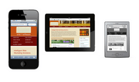
Since I didn’t really have the bandwidth to do a total redesign of the Orbi site, I decided to limit the scope to just a makeover using RWD techniques, at the same time fixing a handful of issues that had been bugging me for some time. While I was in there, I also switched all of the markup from XHTML 1.1 to HTML5. HTML5 is certainly not necessary to make RWD work, but I figured I might as well make the change while I was modifying every web page anyway. And it’s fairly easy to do since HTML5 is backwards compatible. The trickiest part was coming up with a new “reset” style sheet (I ended up choosing this one). Other than the declaration and some syntax, I’m not taking advantage of any cool HTML5 features as of this writing, although I most certainly will in the near future. I smell another blog post brewing…
Marcotte actually recommends starting with the mobile experience first, then creating media queries for increasingly large breakpoints based on the canvas size. While this is probably good advice, I actually did just the opposite for this project in order to make my life easier. I already had a static layout with a width of 926px, so it made sense to set that as the maximum and then work down. I then chose my breakpoints based on the default viewport widths of three popular devices: the iPad (768px in portrait mode), the Kindle (600px), and the iPhone (480px in landscape and 320px in portrait). You’ll find lots of arguments against the use of device breakpoints in RWD, but for my purposes it was a good place to start.

For the most part the project went well, although I did encounter some browser compatibility issues along the way that required workarounds. For example, some versions of Opera don’t honor the fractional portion of floating point percentages when specifying element widths. This is complicated by the fact that the browser does honor them for padding and margins. In places where this clearly broke the design, I employed some additional media query brackets with hard-coded widths. Everywhere else, I just embraced the concept of “progressive enrichment”, allowing fallbacks that don’t look quite as good in Opera, but are still functional. Overall, I’d have to say that I’m pleased with the results. It’s nice bringing up my site on a new device and seeing everything fall into line based on the viewport size. And I’m looking forward to using what I’ve learned in my next project.
